DISCLAIMER: I know better now and don't work on projects supporting the oil and gas industry.
Problem
The global marketing team asked me to help optimize and update Maersk Training’s (MT) website with focus on the user experience.
Background
Maersk Training should be rewarded with a gold star. The company provides courses to improve safety, behaviour and operational performance in offshore industries. Organisations and individuals book seats to courses via MT’s website.
Insight
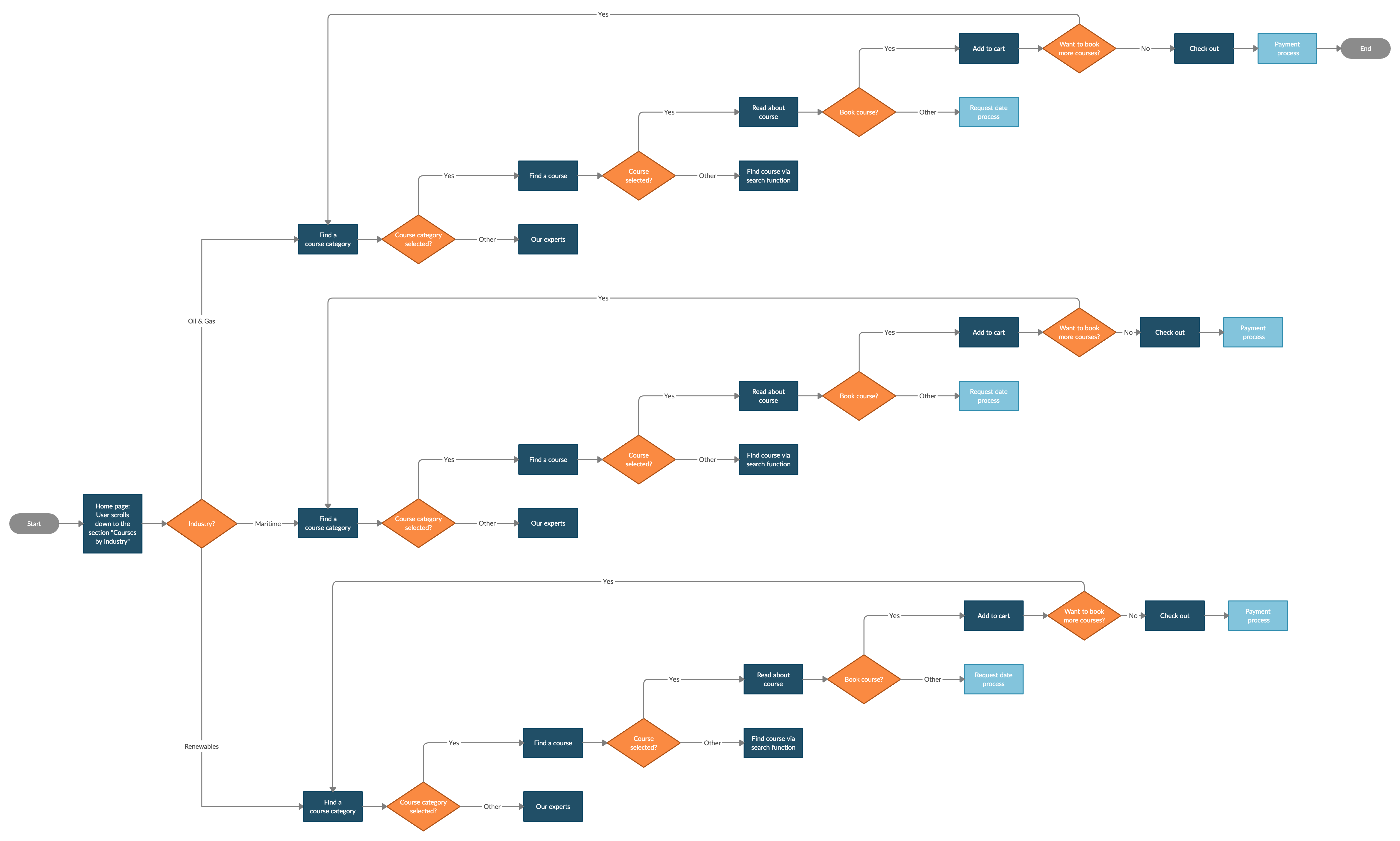
The result of conducting an usability analysis and domain research on the biggest competitor’s websites is a list with potential improvements. It includes buttons to courses for each of the three industries, turn technical descriptions into info graphics and make interactive elements visually clearer.
Solution
This Maersk Training website redesign is a prototype were web accessibility standards and Maersk’s branding guidelines are put into practice.
There's always space for improvement
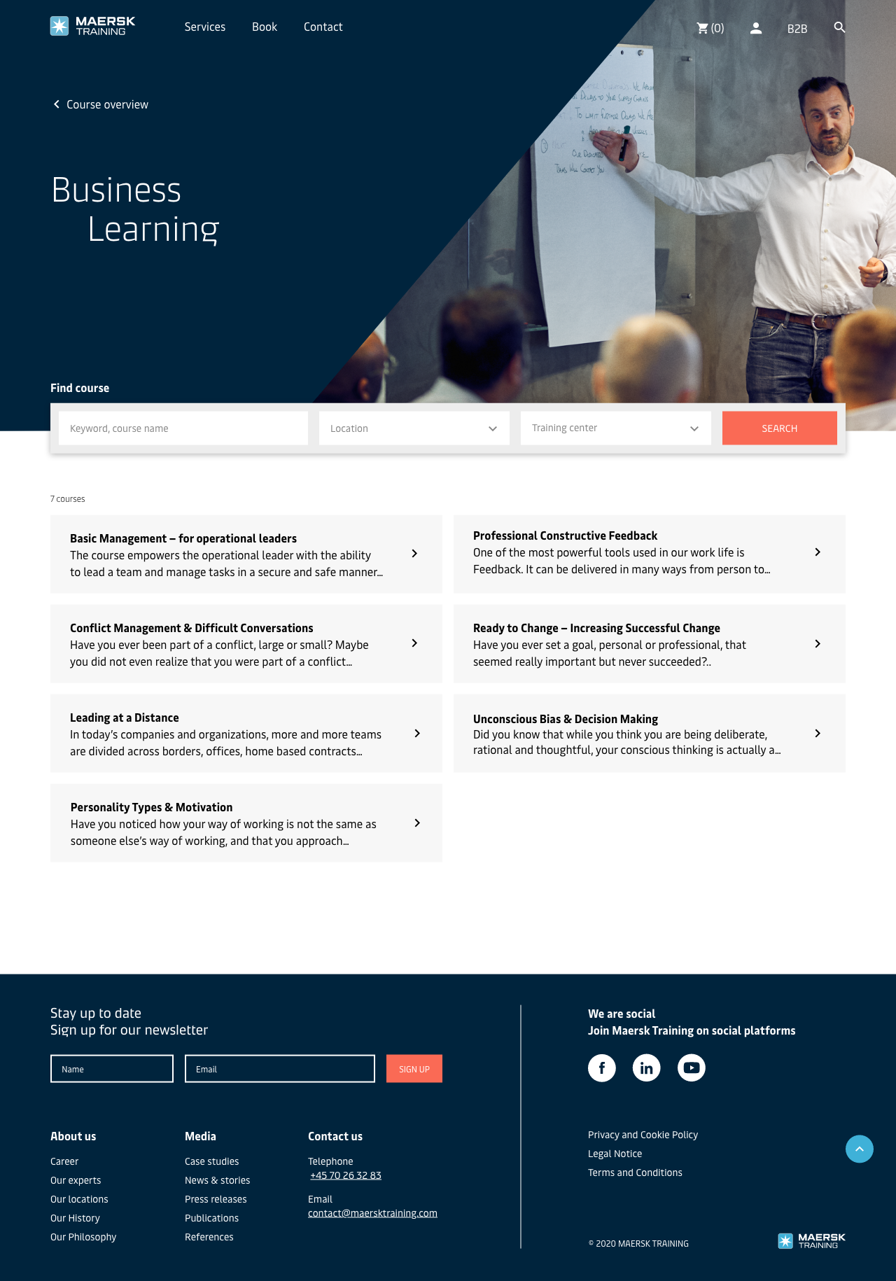
With the purpose of creating a more personal user experience, a new search function makes it possible to write industry specific keyword (ex. renewables), choose a location or training centre. In addition, the section “Courses by industry” is near the fold on home page.
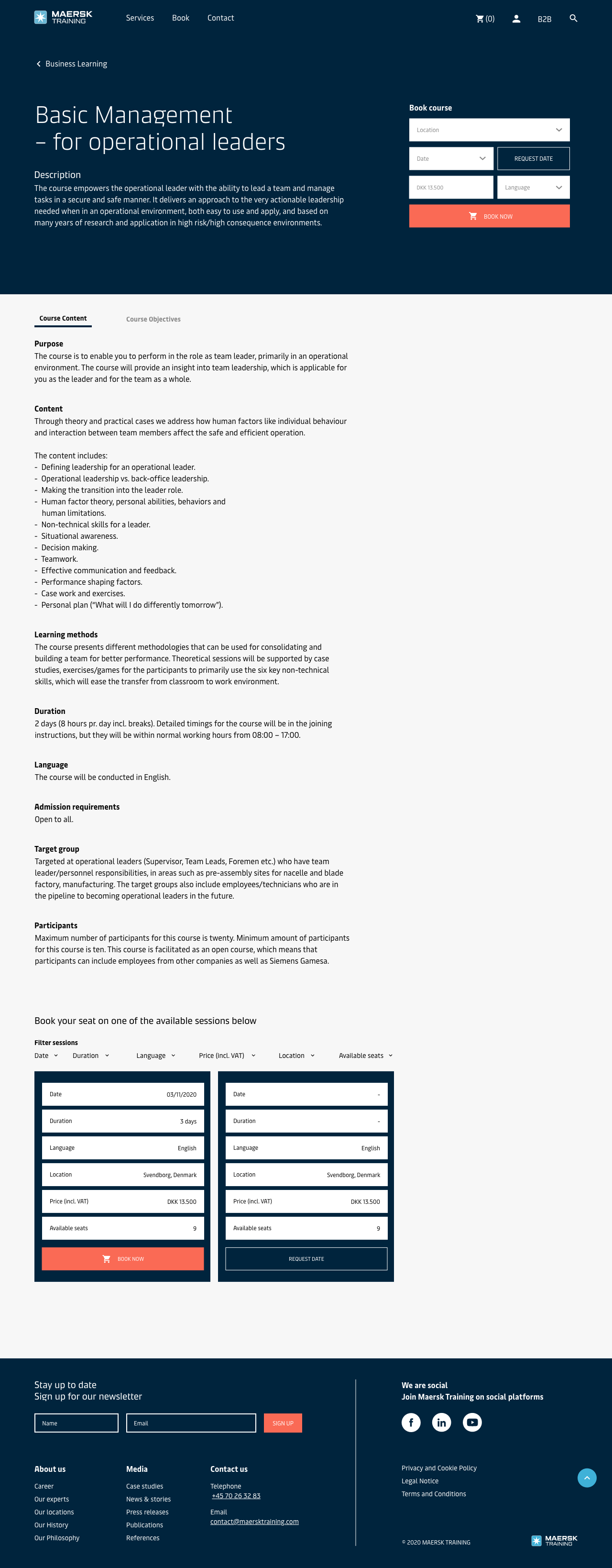
There’s a lot to know before booking a course. To get an overview, the information on the course pages is split into “Course Content” and “Course Objectives” by using a tab bar menu. A part from that, info graphics compliments descriptions of ex. course benefits and training workflow.
Styling of buttons depends on emphasis level. The orange accent colour creates an eye-catching contrast to the blue colours which is ideal for CTA-buttons ex. “Book now”.
Project facts
Collab: Maersk Training Team: Ditlev, G, Kayleigh, Ryan, Tyler & me Year: 2020 Type: Website Deliverables: UX/UI, Info graphics, Icons, Prototype